
The world’s next nursing shortage may not be where you think
The law of averages is hiding a big problem with our global community nursing workforce

Last week I spoke at the International Home Care Nurses Organisation’s conference in London.
So did Howard Catton, Chief Executive of the International Council of Nurses, who said something that I’ve been thinking about all week.
The 5.8 million shortfall is real – but this sits on top of a second problem, distribution which is the bit that most workforce narratives miss. ‘We don’t have enough staff’ is easier to understand than ‘our staff are in the wrong place and don’t have the right skills’ which is a bit more tricky.
Both are then hiding a third problem the averages. A country’s nurse numbers can climb on paper while the gap on the ground between urban and rural only widens.
In many countries, 60 to 65 per cent of the nursing workforce sits in hospitals.
In England, where he happened to be standing, just 12 per cent of NHS nurses work in dedicated community services, while district nurses, health visitors and school nurses go on quietly declining.
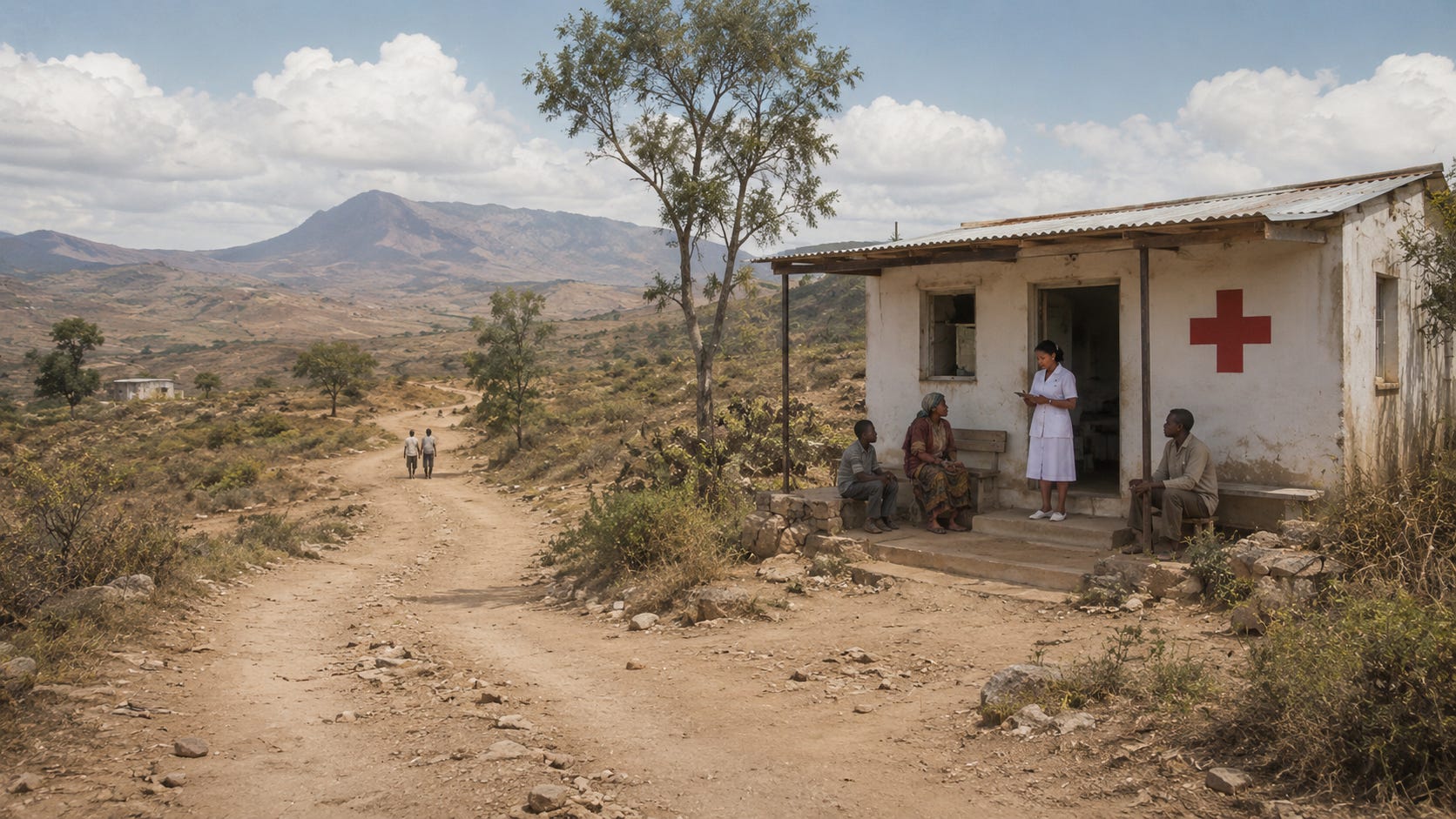
He set this against the image we commonly carry of community nursing: the district nurse on a bicycle, somewhere pastoral, rural, lemon drizzle cake, all very twee, arguing quite rightly that community nursing is incredibly complex. Today’s community nurse administers chemotherapy in a front room and manages drug regimens that would once have required admission, complex care delivered at home, metrics collected on a tablet.
As with most things the issues extend across our world. The maldistribution described does not stop at the edge of the high-income world. In a wealthy system, the staff exist and are in the wrong place. In the poorest regions, they are in the wrong place and there are too few of them to begin with.
So let’s look at where people actually live in relation to where care is . I have spent most of my career focused on the more purple bits of this map,
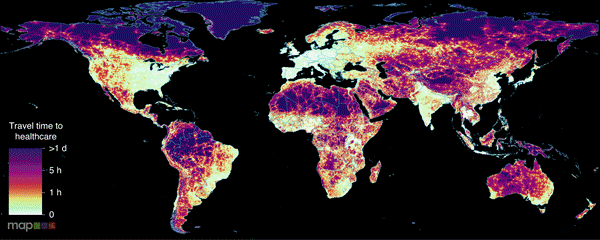
Travel time to the nearest health facility. White and pale green indicate under an hour; deep purple indicates more than a day. Source: Malaria Atlas Project.
So at first glance, I will admit I was pleased. It really doesn’t look too bad! A lattice of bright corridors threads along the roads, and most of the inhabited world looks within an hour or two of help.
But there is one very important factor that I didn’t mention. The first map is our patients journey to healthcare if they have access to a car.
Now take the car away and model the journey as most rural patients in the poorest regions actually make it — on foot.
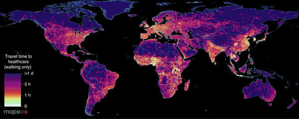
The same map, walking only. The bright corridors collapse into the surrounding purple. Source: Malaria Atlas Project.
The corridors collapse. Across the interior of the Sahel, the Andean highlands, the forest blocks of Central Africa, the nearest facility is now more than a day’s walk away.
The road network was doing the work the first map appeared to credit to the health system, and the people left in the deepest purple are left stranded, adrift on an endless ocean. They suffer just the same health challenges and yet the response and options are far worse. They are the woman in labour who will not reach the clinic, the child whose fever will not be seen.
This is the geography the workforce numbers describe; the bright spots are where almost all of the doctors and many of the nurses already are — cities, the coast, the places a vehicle can reach. The purple is everyone for whom care is a journey measured in days, not minutes. You cannot fix a purple region just by building another hospital but by supporting higher quality community care close to where people live.
The State of the World’s Nursing report, published last May, shows the global workforce has grown to nearly 30 million, and the headline shortage has come down from 6.4 million to 5.8 million. Good news, until you read the next line: 78 per cent of the world’s nurses serve 49 per cent of the world’s population, and the shortfall that remains sits overwhelmingly in low- and lower-middle-income countries. The shortage is shrinking on average and concentrating at the same time.
And a rising density tells you almost nothing about access, because the number that improves is a national average, and a national average hides horrendous disparity. A country can add nurses, watch its nurses-per-thousand climb, and report progress to the WHO, all while the new nurses settle exactly where the old ones already were.
The subnational picture, when anyone bothers to assemble it, is brutal.
India is the cleanest illustration. The headline ratio is about two nurses per thousand — low, but improving, and the kind of number a health ministry can build a narrative around. Underneath it, the density of registered nurses runs from 0.8 per ten thousand in Bihar to nearly 79 in Kerala.
These are two different countries at each end of the same flag.
Nearly two-thirds of Indians are rural, yet the nurses — and most of the colleges that educate them — cluster in a handful of southern and western states. The story repeats across sub-Saharan Africa: in Botswana, one of the better-staffed countries in the region, rural districts had 26 nurses per ten thousand against 77 in urban ones.
Where the nursing education pipeline is strong but the jobs and the pay are not, nurses are trained and then leave — for the capital, or for a high-income system that will pay roughly three times what a low-income one can; in much of Africa, a substantial share of nurses say they intend to emigrate . The destination countries then report a falling shortage and congratulate themselves on a pipeline they did not build. The arithmetic that improves the global figure is, at the source, a story of educating a workforce and watching it walk to where the map is already bright.
In a high-income system, concentrating nurses in hospitals is a misallocation: the staff, largely exist, they are simply in the wrong building, and in principle, with additional education packages and support you could move them.
In LMIC there was never a version of the budget where the rural clinic was staffed. The purple on the map is not an underfunded service, it is a service that was never there at all.
The reflex, when faced with the purple, is to reach for the community health worker, lightly trained, cheap to deploy, close to home. A cadre that is cheap enough to put everywhere is, by construction, a cadre you can underpay and under-equip indefinitely as their career prospects are so much lower. Compared to degree educated nurses they are a far less attractive poach.
The next nursing shortage, then, is not coming, for it is already here: evenly reported and unevenly felt, buried under countrywide averages that obscure profound shortages in our community provision. Follow the map past the merely underserved, all the way into the purple, and ask whether our headline figures are obscuring a distributive disaster.